
Samsung Introduces Major SmartThings Interface Redesign on iPhones First
Samsung has officially rolled out a substantial user interface overhaul for its SmartThings smart home platform, surprising many tech enthusiasts by launching the update on iOS devices before releasing it to Android or Galaxy smartphones. This fresh release brings modern design elements and a much cleaner visual approach to Apple users.
Key Takeaways
- ✨ Samsung launched the redesigned SmartThings application on iPhones ahead of Galaxy devices.
- ✨ The update introduces a lighter color scheme and Apple's Liquid Glass design language.
- ✨ A floating navigation bar and compact dynamic summary cards enhance the overall user experience.
- ✨ TV virtual remotes now support a dedicated Light Mode with customizable floating placements.
Fresh Aesthetics and Floating Navigation
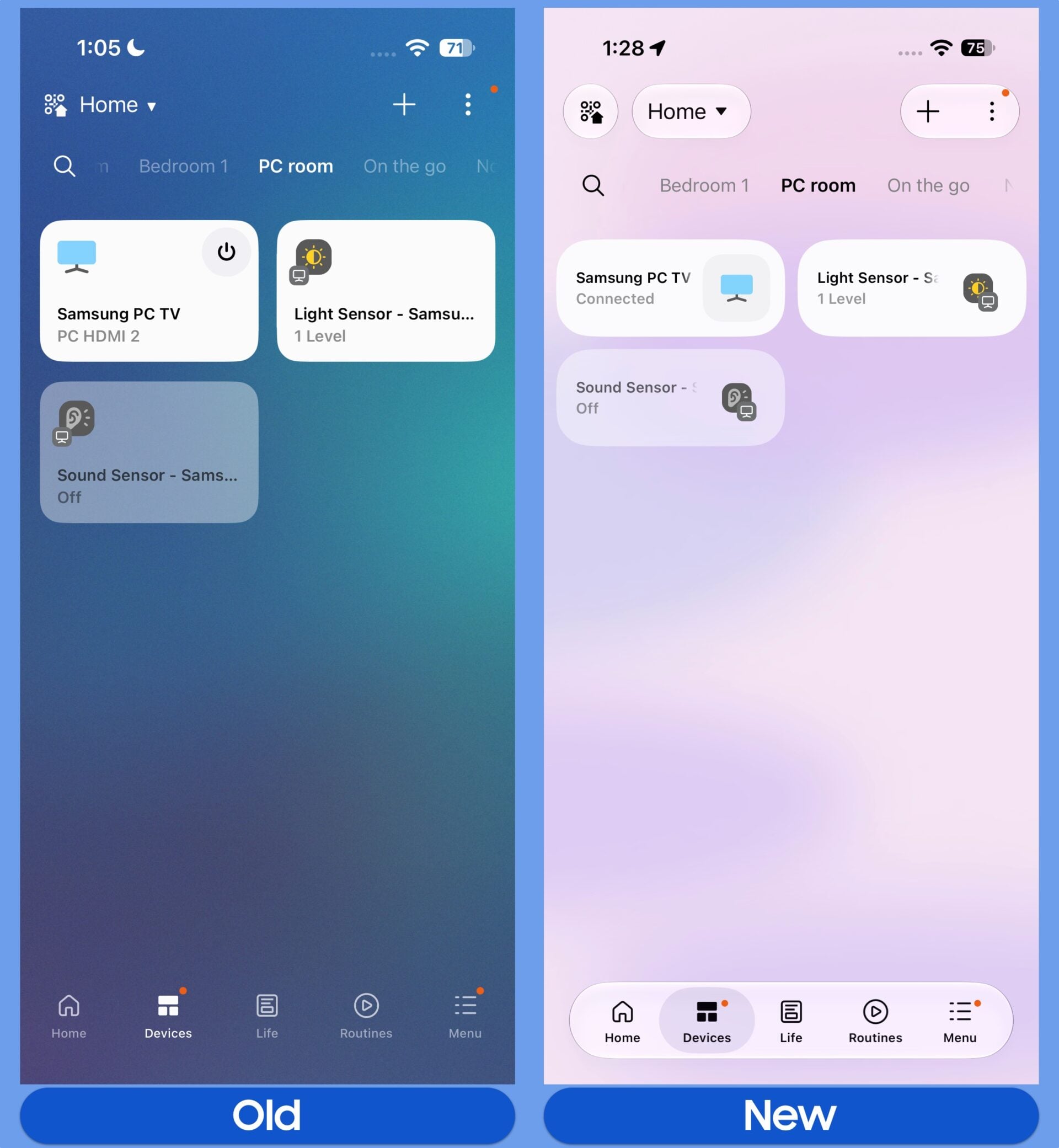
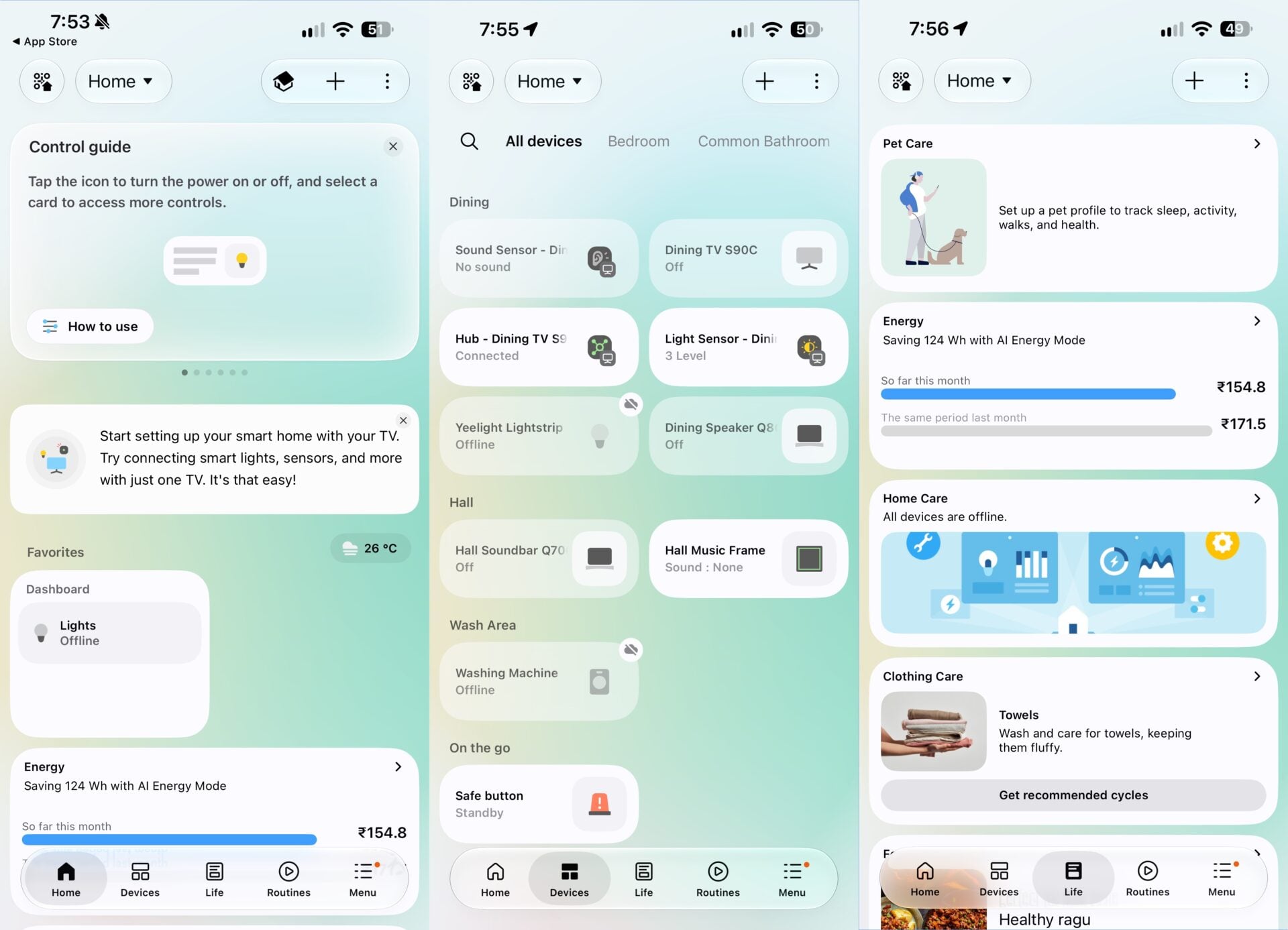
Samsung has spent the past few months developing a massive UI refresh for the SmartThings ecosystem. With version 1.7.51 now live on the iOS App Store, users are greeted with Apple's Liquid Glass design aesthetic alongside a brighter, more vibrant color palette. While the app maintains its signature five primary tabs, navigation is now anchored by a sleek, floating bar that gives the software a modern feel.
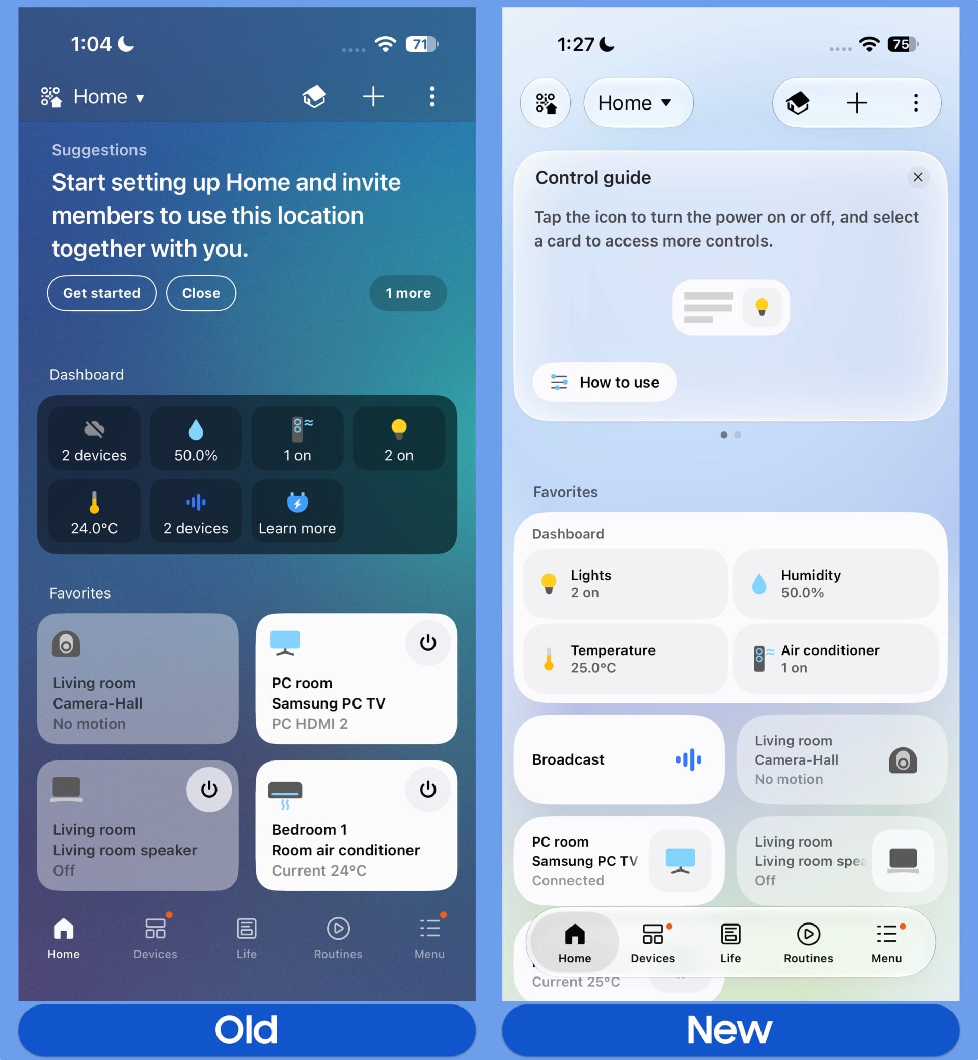
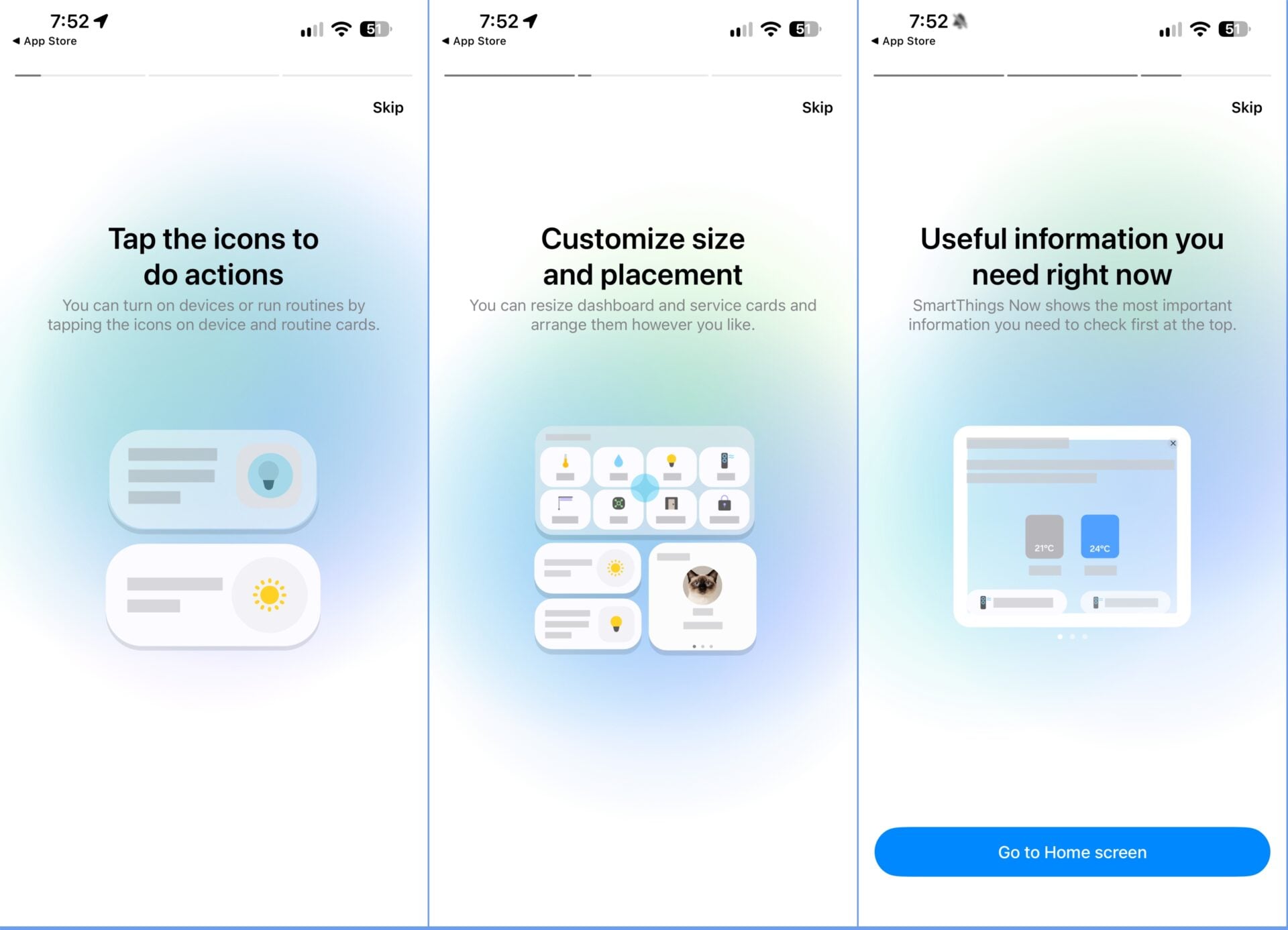
By default, connected devices and automated routines are housed inside more compact cards. Users who prefer a larger view can easily adjust card sizes to suit their needs. Tapping directly on a device icon instantly toggles it on or off, whereas selecting any other part of the card launches the complete control menu.
Smart Summaries and Dedicated TV Remote Mode
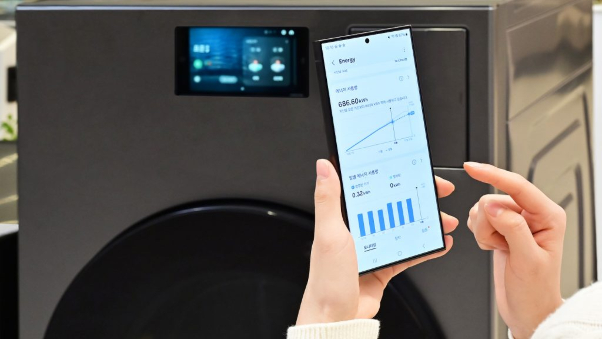
At the very top of the Home tab, a newly implemented dynamic summary card showcases essential insights. This includes metrics like monthly energy consumption, quick media controls for compatible TVs, security notifications, and recommended home automations. Anyone who prefers an uncluttered view of their hardware can easily dismiss this summary card.
Furthermore, the virtual remote control built for smart televisions and monitors has gained a dedicated Light Mode. It can be scaled down for effortless one-handed use and repositioned into any corner of the display. Although major interface elements have evolved, deeper plugins for specific home appliances such as air conditioners, soundbars, and laundry machines continue to utilize the classic layout until a future update arrives.
Why did Samsung release the SmartThings redesign on iPhones first?
While Samsung typically prioritizes its own Galaxy hardware ecosystem, software deployment cycles sometimes vary. The iOS version finished development and passed App Store verification ahead of the corresponding Android and One UI builds.
What is the primary design inspiration behind the new interface?
The updated application incorporates Apple's Liquid Glass visual language, featuring lighter color tones, translucent layers, and a floating navigation bar.
Can I resize the device cards on the home screen?
Yes, the app defaults to compact cards for your connected ecosystem, but you can easily scale them up if you prefer a larger visual layout.
Are all device control sub-menus updated in this version?
Not yet. While the main tabs and navigation have changed, specific appliance plugins for items like washers, dryers, and soundbars retain their traditional design for now.
🔎 Ultimately, this early iOS release provides a promising glimpse into the future of Samsung's smart home software strategy. As the company continues refining these layouts, Galaxy smartphone users can eagerly anticipate receiving these polished visual upgrades and functional enhancements in their own upcoming app releases.
Post a Comment